
返回AI首页


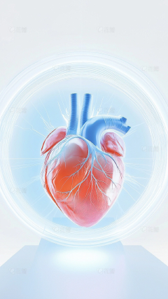
3D渲染人体心脏医学元素
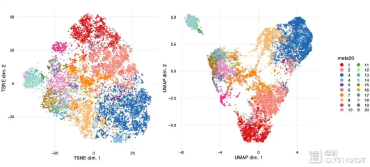
A stunning data visualization scatter plot, thousands of tiny glowing dots clustered together to form the precise anatomical shape of a human heart. Resembling a UMAP or t-SNE bioinformatics clustering graph. The dots are divided into distinct vibrant color groups (red, cyan, orange, lime, purple) representing different data clusters. Deep dark blue background. High-tech, scientific data art, intricate details, 8k resolution, clean and modern. No text, no axes, no labels.

描述你想生成的图片信息,如:画面里有什么风格/元素/色彩
Shift+回车 = 换行
智能设计
做同款
AI可能会犯错误或不完全遵循,请谨慎使用。
同款 0
评论 0